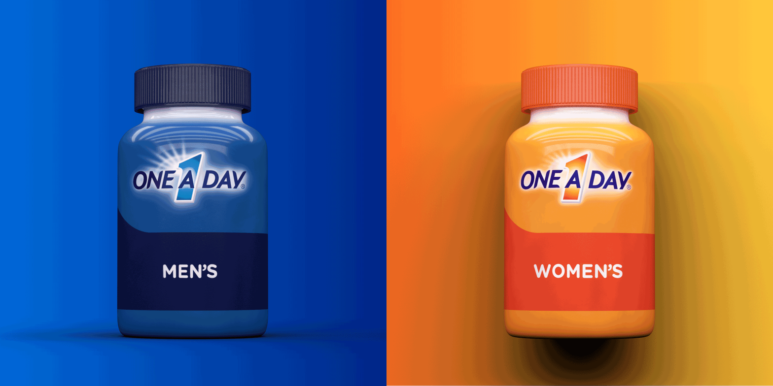
One A Day.
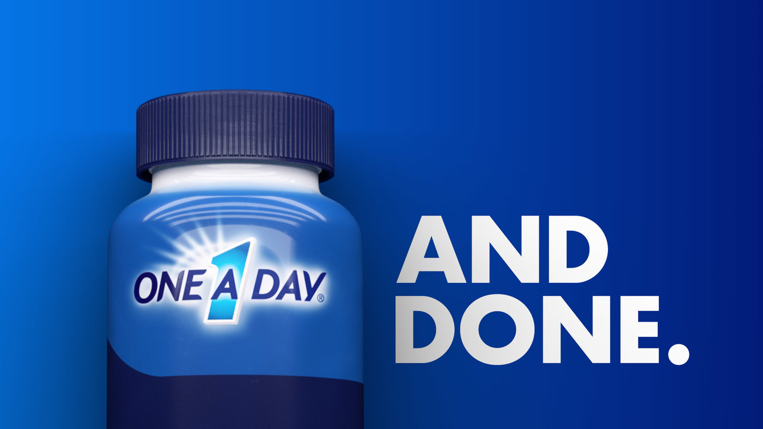
The One A Day brand has been around for quite some time and once innovated the multivitamin market. With much more competition today from on-demand online stores like Amazon and subscription-based products, they needed our help to set them apart from the rest of the market once again. We created the new brand platform "One A Day and done" and introduced an evolution of their brand identity.
Role: Design
Project: Brand Identity System
Design Director: Hung Vinh
Creative Directors: Erika Hillman, Michele Brandel
We made the primary logo for One A Day a simplified version of itself for a modern evolution. It allows us to stretch the number ‘1’ further as a distinctive design element to become synonymously associated with the original multi-vitamin brand.
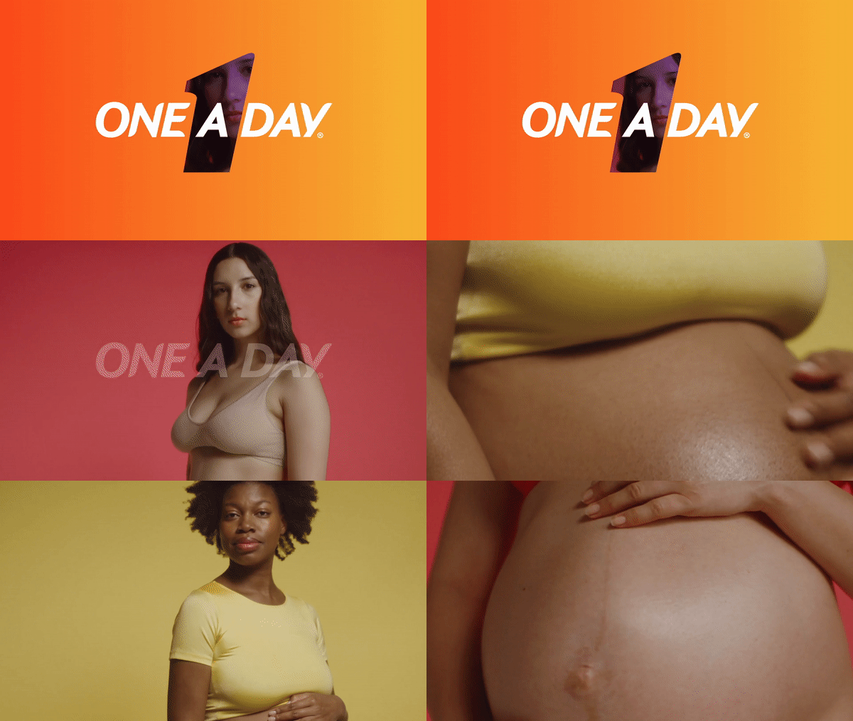
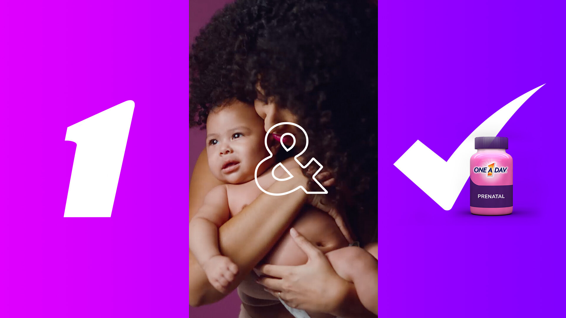
We created a subtle gradient color palette for the One A Day brand that gives it a distinct look apart from other vitamin brands. This also allowed us to create a color system that focuses on one gradient color at a time pertaining to each respective product in the One A Day line.
FUTURA is the primary typeface used for headlines and supers. With its low contrast and evenly-weighted strokes, it creates an appearance of simplicity and efficiency, aligning to the brand’s purpose of “Superior nutrition made simple”.
HELVETICA NEUE is our secondary typeface used in subheads or body copy. With its neutral feel and clarity, it serves as a great complimentary typeface to Futura.


